

Checkout is the moment where interest turns into revenue. A customer has already chosen a product, added it to the cart, and decided to pay. The only thing left is to get out of their own way and let them finish. Yet checkout is also where many stores unintentionally introduce friction: extra clicks, repeated fields, unclear shipping options, or a payment step that feels disconnected from the rest of the order.
Customers generally expect checkout to be predictable and quick. They want to see what they're buying, know what it costs, choose how it ships, pay, and get confirmation without having to guess what happens next. When a checkout process adds unnecessary steps or forces customers to navigate between disconnected screens just to complete a straightforward order, that complexity becomes friction, even if every step is technically necessary.
One Page Checkout is one approach nopCommerce store owners can consider when looking to simplify this journey. Rather than moving customers through several separate pages, a one-page approach consolidates the key checkout steps into a single, structured view. This article looks at what that means in practice, how it compares to a traditional multi-step nopCommerce checkout, and what to evaluate including Shivaay Soft's Instant One Page Checkout plugin before making a change to your live checkout flow.
Why the Checkout Experience Matters for nopCommerce Stores
Checkout is where design decisions have the most direct business impact. A product page can be mediocre and still convert if the offer is strong; a confusing checkout can stall an otherwise motivated buyer at the last step.
A few areas deserve particular attention on any nopCommerce store:
Purchase flow clarity customers should always know which step they're on and what comes next.
From complexity every additional field is something a customer has to stop and think about, especially on mobile.
Shipping selection, unclear delivery options or late-appearing shipping costs create hesitation.
Payment selection the available payment methods and how they're presented affect completion.
Order review customers want to double-check quantities, pricing, and totals before committing.
Mobile usability: a large share of nopCommerce traffic now completes checkout on a phone, where layout and input friction matter more.
Trust and transparency, clear totals, policies, and confirmation messaging reduce hesitation at the final step.
The goal of checkout optimization isn't to strip the process down to the bare minimum. It's to remove friction that doesn't serve a purpose while keeping the information, validation, and business logic the store actually needs.
What Is One Page Checkout?
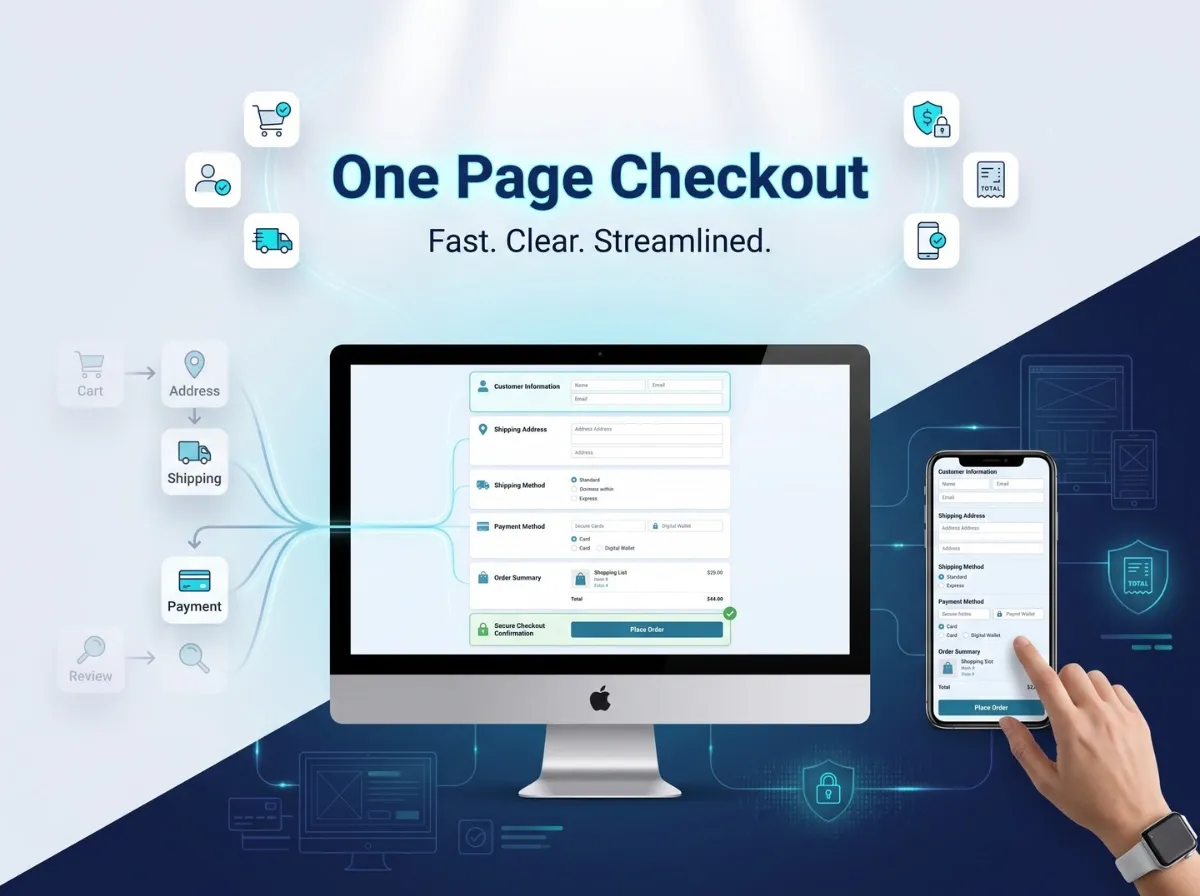
One Page Checkout describes a checkout experience that consolidates the core purchase steps of customer information, billing, shipping, shipping method, payment method, order summary, and confirmation into a more streamlined page or flow, rather than spreading them across several separate screens with full page reloads in between.
In a typical multi-step layout, a customer might move through distinct pages for billing address, shipping address, shipping method, payment method, and a final confirmation page before the order is placed. A one-page approach groups these into organized sections on a single screen (or a single scrollable/tabbed flow), so the customer can see more of the process at once.
The exact implementation of One Page Checkout varies depending on the platform, theme, and plugin configuration. Some approaches use collapsible sections, others use a single scrollable form, and the level of customization available depends on the specific plugin and how it integrates with the store's existing checkout logic.

What Is Instant One Page Checkout for nopCommerce?
Instant One Page Checkout is a checkout plugin built by Shivaay Soft for the nopCommerce platform. According to Shivaay Soft's official product page, the plugin is designed to make the checkout process simpler, more flexible, and more user-friendly, with the aim of saving customers time when completing a purchase.
Based on the verified product documentation, Instant One Page Checkout includes the following features:
Reduces the standard six-step nopCommerce checkout to a single page.
Customers can remove items or edit quantities directly on the checkout page, without returning to the cart.
Quick selection of shipping and billing addresses from the same view.
Support for displaying checkout attributes on the one-page layout, such as gift wrapping options.
The ability to enter coupon codes and gift card codes directly during checkout.
Support for both guest checkout and registered customer checkout.
A mobile-friendly, fully responsive layout.
On the specification side, the plugin is listed as supporting nopCommerce versions 4.70, 4.80, and 4.90, includes RTL (right-to-left) language support, is built with a clean HTML and CSS structure intended to make customization easier, is fully localizable, has been tested across major browsers, and comes with one year of free support and upgrades from the purchase date.
In the context of checkout optimization, Instant One Page Checkout is positioned as a way to reduce the number of distinct steps and page transitions a nopCommerce customer has to go through, while keeping core checkout functionality addresses, shipping, payment, discounts available on one screen.
Traditional Multi-Step Checkout vs One Page Checkout
There is no universal answer to which model is better. The right checkout structure depends on product type, typical customer behavior, shipping requirements, available payment methods, store design, the proportion of mobile traffic, and internal business workflows. A store selling configurable B2B products with multiple approval steps has different needs than a direct-to-consumer store selling a handful of SKUs.
How One Page Checkout Can Improve the Customer Experience
1. Reduces Unnecessary Navigation
Consolidating checkout steps can reduce the amount of clicking and page-loading a customer has to do to complete an order. Fewer transitions mean fewer moments where a customer has to reorient themselves on a new page. This is about clarity and flow, not a guaranteed increase in completed orders - results still depend on the store's traffic and offer.
2. Gives Customers a Better View of Their Order
An order summary that stays visible throughout checkout helps customers keep track of products, quantities, unit pricing, shipping charges, and the running total. When customers can see this information without switching screens, they're less likely to second-guess what they're paying for.
3. Creates a More Continuous Checkout Flow
Rather than treating billing, shipping, and payment as isolated steps, a one-page structure presents them as parts of one connected process. Customers can move between sections without losing context, which can make the overall experience feel more coherent.
4. Can Improve Mobile Checkout Usability
Mobile checkout has its own constraints: limited screen space, on-screen keyboards, and the need for clearly separated form sections. A well-built one-page checkout can group information into clear, collapsible or scrollable sections, use touch-friendly controls for shipping and payment selection, and keep the order summary accessible. It's worth noting that not every one-page checkout implementation is automatically mobile-optimized; that depends on how the specific plugin and theme handle responsive layout.
5. Helps Identify Checkout Friction
Reviewing your existing checkout whether or not you change its structure is a useful exercise on its own. It often surfaces repeated form fields, steps that don't add value, confusing navigation between pages, shipping costs that appear late in the process, or a payment selection step that's harder to use than it needs to be.
Key Elements of an Effective One Page Checkout
Regardless of which plugin or approach a store uses, a few elements consistently matter:
Clearly separated sections for customer information, address, shipping, payment, and order summary
Accurate, real-time order totals that update as options change
Visible shipping method options with associated costs
Available payment methods presented clearly
Inline validation and error messages that tell customers exactly what to fix
Mobile-appropriate input types and spacing
Transparent pricing with no costs that appear unexpectedly at the final step
Trust indicators where appropriate, such as secure payment badges or clear policy links
Simplifying the interface should never mean removing information customers need to make a confident decision. The goal is to organize that information better, not hide it.
How Instant One Page Checkout Fits into a nopCommerce Store
Introducing any checkout plugin into an existing nopCommerce store is a technical change, not just a visual one. Before deployment, it's worth thinking through:
Store theme compatibility how the plugin's markup and styling interact with your current theme
Existing checkout workflows any custom logic already built into your checkout
Payment methods which gateways your store uses and how they render within the new layout
Shipping methods how shipping rules and rates are calculated and displayed
Guest checkout configuration whether guest checkout is enabled and how it should behave
Customer accounts how returning customer data (saved addresses, order history) is handled
Custom plugins whether other checkout-related extensions are installed
Store-specific customization any bespoke fields or business rules already in place
Shivaay Soft's documentation specifies supported nopCommerce versions (4.70, 4.80, 4.90) and notes that the plugin uses a clean HTML/CSS structure intended for easier customization. It does not claim compatibility with every theme, every payment gateway, or every custom workflow and it shouldn't be assumed to. As with any checkout-level change, testing in a staging environment before production deployment is the responsible approach.
Step-by-Step Checklist Before Implementing One Page Checkout
1. Review Your Current Checkout Journey Look at the number of steps, where customers seem to drop off, how checkout performs on mobile, how many form fields are required, and which shipping and payment methods are offered.
2. Review Store Customizations Identify any custom checkout code, existing checkout-related plugins, theme-level modifications, and current payment or shipping integrations that a new plugin will need to coexist with.
3. Review Plugin Compatibility Confirm your nopCommerce version against the plugin's supported versions, check the plugin version itself, and consider theme compatibility and existing customizations. Only rely on compatibility details confirmed in the official product documentation.
4. Test on Staging Before touching your live store, test guest checkout, registered customer checkout, address selection, shipping calculation, payment processing, discount and gift card codes, order totals, and the experience across multiple mobile devices.
5. Monitor After Launch Once live, keep an eye on checkout errors, customer feedback, payment failures, shipping calculation issues, and overall order completion behavior for at least the first few weeks.
One Page Checkout and Mobile Commerce
Mobile checkout carries its own set of constraints that deserve dedicated attention: smaller screens limit how much information can be shown at once, on-screen keyboards can obscure form fields, address entry is more error-prone on a touchscreen, and page speed has a more noticeable impact on smaller connections.
Practical considerations for mobile checkout include:
Large, touch-friendly buttons and form controls
Clear, legible form labels
Only the fields that are actually required
Validation errors that are visible without scrolling
An order summary that's easy to review without excessive scrolling
A genuinely responsive layout, not just a scaled-down desktop design
Payment and Shipping Considerations
Checkout improvements only matter if they work correctly with how the business actually operates.
Payment:
Which payment methods are available and how they're displayed
How the plugin integrates with your existing payment gateway(s)
How payment errors are communicated to the customer
How payment confirmation is handled
Ensuring payment processing remains secure throughout the flow
Shipping:
Which shipping methods are offered and how rates are calculated
How delivery information is presented to the customer
How shipping costs are displayed relative to the rest of the order
Address validation
How the checkout handles multiple shipping scenarios, such as different delivery options or split shipments
Compatibility with a specific gateway or shipping provider should always be confirmed against the plugin's documentation rather than assumed.
Common One Page Checkout Mistakes to Avoid
Too Many Form Fields :- Consolidating steps onto one page doesn't mean every field from every step should stay. Review whether each field is actually necessary.
Overloading the Page with Information :- A single page can still feel cluttered if sections aren't visually separated.
Poor Mobile Design :- A one-page layout that isn't properly responsive can be harder to use on mobile than a well-designed multi-step flow.
Unclear Validation Errors :- Customers need to know exactly what went wrong and where, especially when everything is on one screen.
Hidden Costs :- Shipping fees or taxes that appear only at the final total undermine trust, regardless of checkout structure.
Poor Order Summary Visibility :- If customers can't easily see what they're paying for, consolidation doesn't help.
Ignoring Payment Errors :- Failed payments need clear, actionable messaging, not a generic error.
Ignoring Shipping Scenarios :- Edge cases like split shipments or unavailable delivery options need to be handled gracefully.
Skipping Plugin Testing :- Deploying a checkout change directly to production without staging tests risks disrupting live orders.
Not Monitoring Checkout Performance :- Launching a new checkout isn't the end of the process; ongoing monitoring catches issues real customers encounter.
How to Measure Checkout Experience Improvements
Rather than assuming a checkout change has improved things, measure it using your own store's analytics. Useful metrics include:
Checkout starts vs. checkout completions
Payment failure rates
Form validation error frequency
Mobile vs. desktop checkout performance
Direct customer feedback
The full cart-to-order journey, not just the final step
It's worth being clear that no checkout structure guarantees a specific improvement in conversion rate. Results depend on traffic quality, pricing, available payment options, overall UX, shipping costs, and other store-specific factors. Checkout structure is one variable among many.
Instant One Page Checkout vs Custom Checkout Development
A ready-made plugin like Instant One Page Checkout can be a good fit for stores whose checkout requirements align with its available functionality. Custom development becomes more relevant when a store has specialized workflows, complex pricing logic, or integrations that a general-purpose plugin isn't built to handle. Neither approach is inherently superior the right choice depends on what the store actually needs.
When Should a nopCommerce Store Consider One Page Checkout?
One Page Checkout is worth evaluating when:
The current checkout journey feels unnecessarily long or complex
Mobile checkout usability needs improvement
Customers need a clearer, more visible purchase flow
The store wants to reduce navigation between checkout steps
Existing business requirements are compatible with a streamlined, single-page structure
Additional analysis is usually warranted when a store has complex B2B purchasing workflows, multiple fulfillment processes, highly customized checkout logic, complex pricing or discount rules, or specialized third-party integrations that need to be preserved.
Why Choose Shivaay Soft for nopCommerce Checkout Customization?
Shivaay Soft works across the nopCommerce ecosystem, including nopCommerce development, custom development for stores with specific requirements, nopCommerce plugin development, checkout customization, payment gateway integration, shipping integration, API integration, nopCommerce theme development, nopCommerce version upgrades, and ongoing technical support.
For stores whose checkout needs align with its documented functionality, Instant One Page Checkout offers a structured way to consolidate the checkout process without building a solution from scratch. For stores with more specific or complex requirements, Shivaay Soft's development team can also scope custom checkout work directly.
Conclusion
Checkout experience is one of the most consequential parts of eCommerce usability it's the last interaction before a customer makes an order. Before making changes, it's worth identifying where real friction exists in your current flow, rather than assuming any particular checkout structure is the fix.
One Page Checkout can help create a more connected, easier-to-follow purchase flow by consolidating steps that would otherwise be spread across multiple pages. Whether that structure is right for your store depends on your mobile traffic, payment and shipping setup, existing customizations, and how your customers actually shop.
For nopCommerce stores whose requirements fit its documented functionality, Instant One Page Checkout is one option worth evaluating and thorough staging testing should come before any live rollout, regardless of which solution you choose.